A basic responsive bar chart in reactjs can be hand coded easily.
When developers are faced with any sort of problem that involves data visualization, most google d3 chart examples and find some d3 code example that sort of satisfies their criteria, but they still need to do some reverse engineering to get it exactly right. What seems to be a simple bit of refactoring can turn into a nightmare. This is because d3 can be a little bit tricky to understand, and there is a learning curve. A slight variation in the visual requirement can sometimes involve rewriting the whole of your chart code.
When I am faced with problems that involve the creation of simple bar charts I always turn to code it from the ground up using SVG.
This article will take you through the steps in building a basic infographic type bar chart, that will visualize data from a set of monthly expenses.
Here is the video that shows the step by step guide to creating a basic responsive bar char
Create a responsive bar chart in reactJs.
What we are building
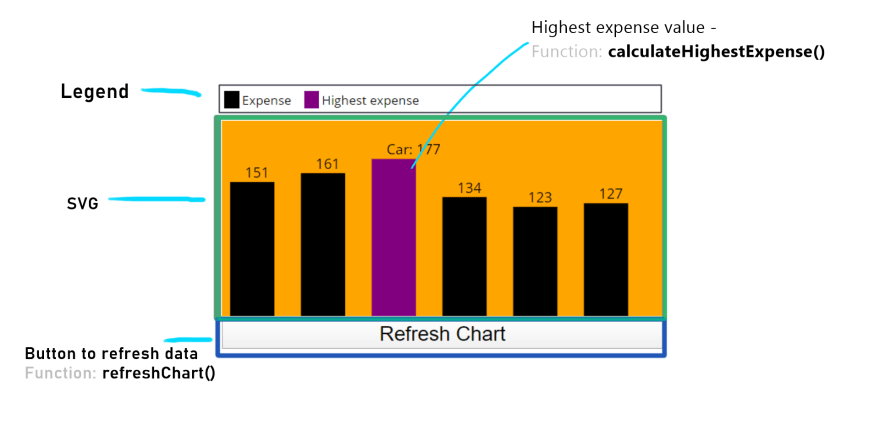
Here is what our bar chart will look like, as you can the highest value is displayed with name and value and the bar color is purple.
The structure of the app
Below is the basic visual structure of the app, we have a legend, and SVG that houses the chart and a button. There is a function associated to the button, we will call this refreshChart(), this should generate a random set up expenses. As you can see we also need a function to return the highest expense, we will call this calculateHihestExpense().
Before we draw our chart we need to specify some measurement values :
- Maximum expense value = 200
- Number of bars = 6
- Chart height = maximum expense value +20 pixels top margin = 220
- each bar would have 30 pixels right margin
- each bars width will be 50 pixels
- Chart width = (bar wdth(50) + bar mergin(30) ) * number of bars(6)
I have chosen these numbers to make our demo simple, in real life, you would not have any such restrictions.
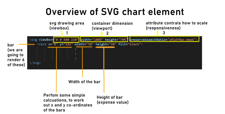
To draw our chart in SVG, we need to structure the SVG container using the values we have specified as shown above. The three yellow boxes in the diagram are important attributes that make the SVG responsive and display correctly. In the first yellow box we have the SVG drawing area, we will give this a dimension of 400 wide by 220 hieght. The second yellow box is the view port, we have given this width of 100% and 70% high. Note the discrepancy between the viewport and viewbox values. The Viewport percentage numbers allow us to scale it to the window size. But it will only scale propelry if we have the the attribute given in the third yellow box, which is:
preserveAspectRatio="xMidYMax meet"
The whole subject area around SVG and scaling is a bit of a complex area, you can read more about it in this article on csstricks.
In the diagram above, we also have a tag which renders a bar for each of the expenses with x,y, width, and fill color as attributes.
The diagram shows a sample of the markup that we are aiming for in our demo app, the challenge is to create the same dynamically with our data in react. So that's what we are going to do.
Our app structure - start with a skeleton code
After you create the boilerplate app using create-react-app and do the necessary cleaning up, we can use the above information to construct a skeleton structure of our app. The code for App.js, shown below will setup the legend, initialize the configuration for our chart, and set up a blank SVG canvas with the specified dimensions:
//App.js
import React , {useState,useEffect} from 'react';
import './App.css'; //Sample data for expenses for the month
const data = [ { name: "Phone", expense: 151 }, { name: "Electricity", expense: 100 }, { name: "Car", expense: 5 }, { name: "House", expense: 43 }, { name: "Food", expense: 56 }, { name: "Leisure", expense: 182 }
]; function App() { // Initialization values that include chart and bar dimensions const [expensesData, setExpensesData] = useState(data); // State value for expenses const maxExpense = 200; const chartHeight = maxExpense + 20; const barWidth = 50; const barMargin = 30; const numberofBars = expensesData.length; let width = numberofBars * (barWidth + barMargin); // Calculate highest expense for the month const calculateHighestExpense = (data) => {} //Button click handler that refresh's expenses data let refreshChart = ()=> { } //Render chart return ( <> <p className="legend"> <span className="expense">Expense</span> <span className="highest-expense">Highest expense</span> </p> <Chart height={chartHeight} width={width}> {/* To Do: Render children , these will be our bars*/} </Chart> <button onClick={refreshChart}>Refresh Chart</button> </> );
} //Component to render SVG chart
const Chart = ({ children, width, height }) => ( <svg viewBox={`0 0 ${width} ${height}`} width="100%" height="70%" preserveAspectRatio="xMidYMax meet" > {children} </svg>
); export default App
Next lets complete the function "calculateHighestExpense" :
// Calculate highest expense for the month const calculateHighestExpense = (data) => data.reduce((acc, cur) => { const { expense } = cur; return expense > acc ? expense : acc; }, 0);
in this function, all we are doing is applying the javascript function reduce on our data array. It will go through one by one comparing values and keeps track of the highest value and then return the highest value at the end. We will use the value returned to set a state for highestExpense :
const [highestExpense, setHighestExpense] = useState(calculateHighestExpense(data));
The Chart component
Next, we are going to render the children for chart component. In the skeleton code above we have the JSX section for the chart componet, that currently looks like :
<Chart height={chartHeight} width={width}> {/* To Do: Render children , these will be our bars*/} </Chart>
The chart bar component will be rendered In the commented area that currently says "To Do". We are going to render a bar for each expense in our data, so we will need to apply the map function to the data array. Each bar will render a element with our bar dimensions. So for the above code will look like this now :
<Chart height={chartHeight} width={width}> {expensesData.map((data, index) => { const barHeight = data.expense; return ( <Bar key={data.name} x={index * (barWidth + barMargin)} y={chartHeight - barHeight} width={barWidth} height={barHeight} expenseName={data.name} highestExpense={highestExpense} /> ); })} </Chart>
In the above block of code, I have declared and assigned barHeight to equal data.expense. The barheight is then used to calculate the y value. The x value of the bar will be calculated by the formulae (index * (barWidth + barMargin)). The rest of the attributes for our Bar component is self-explanatory.
The Bar component
Now that we have the chart component completed and we know what all the attributes for the Bar component will be, we can write the Bar component function. The bar component will return a element with the appropriate attributes to correctly display it in our svg canvas. This component function will look like :
const Bar = ({ x, y, width, height, expenseName,highestExpense }) => ( <> <rect x={x} y={y} width={width} height={height} fill={ highestExpense===height ?`purple`:`black`} /> <text x={x + width / 3} y={y - 5}> {highestExpense===height ? `${expenseName}: ${height}` : `${height}`} </text> </> );
We are returning a element with the calculated values of x,y,width and height. Additionally if the current bar has the highest expense value then we want to display the bar in purple, otherwise, display the bar with black color. In the code above, we are alternating the colors with the following ternery expression in the fill attribute:
fill={ highestExpense===height ?`purple`:`black`}
Here we are using strict equality '===' to test if highestExpense is equal to height, height is also the expense value in this block of code.
In the bar component function we also return a element that also ahs has another ternary expression to alternate the text:
{highestExpense===height ? `${expenseName}: ${height}` : `${height}`}
again we test if the highestExpense is equal to height, if it is then we render a label with the name and expense, otherwise, just render the value. Note that we are using backticks to output strings ie ${expenseName}: ${height}. We use backticks because this allows us to combine variables in our strings, this is a ES6 feature called string templates.
.... and finally the button to refresh
In the skeleton code that was presented earlier we had the button markup, this had an onClick callback function called refreshChart associated with it:
<button onClick={refreshChart}>Refresh Chart</button>
So the final piece of code we need to write is the callback function "refreshChart" that handles the click. This function will do two things, one , recalculate the array items by setting the expense item to a new expense for each array item. Secondly, it will set new states. We can write the function to generate a new set of random values as a separate function first:
const createRandomData = (data) => data.map((exp) => ({ name: exp.name, expense: Math.floor(Math.random() * maxExpense) }))
then we can use this in our refreshChart function that handles the click:
let refreshChart = ()=> { const newData = createRandomData(expensesData); const newHighestexpense = calculateHighestExpense(newData); setExpensesData(newData); setHighestExpense(newHighestexpense); }
The final code and conclusion
You can access the final code on github at https://github.com/ui-code-tv/barchart-demo-react
There is so much more you could do with SVG, this is just scratching the surface. The hardest part of working with SVG is understanding the coordinate system and general drawing of shapes and paths. You can read more about SVG co-ordinate system here https://www.sarasoueidan.com/blog/svg-coordinate-systems/.


