
Implement Angular Material Dialog in your Project
Have you ever built an Angular Project or building an Angular Project, then you stumbled on the need for Dialogs (Confirm or Message Dialogs)?

A normal Javascript Confirm Window
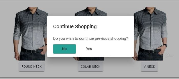
An Angular Material Confirm Dialog
In this post, I will be guiding you on steps to only use the Dialog Feature of Angular Material, without importing all other Material Components. One important advantage of this dialog is that you can pass values to the dialog dynamically.
Requirements
You will need an existing Angular 2 or above project to proceed. Please create one if you don’t have using the command:
ng new modal-demo
Install Angular Material and CDK using NPM:
npm install — save @angular/material @angular/cdk
Now, let’s create the dialog component using Angular CLI:
ng g c my-dialog --spec false
In your my-dialog.component.ts , add the following:
import { Component, Inject } from ‘@angular/core’;
import { MAT_DIALOG_DATA } from ‘@angular/material’;
Next, inject the MAT_DIALOG_DATA in your constructor, which accept the data passed to your modal. Should look like this:
modalTitle: string;
constructor(@Inject(MAT_DIALOG_DATA) public data: any) {
this.modalTitle = data.title;
console.log(data)
}
In your my-dialog.component.html , let’s create the Modal design:
<h2 mat-dialog-title>{{modalTitle}}</h2>
<mat-dialog-content>Do you wish to continue previous shopping?</mat-dialog-content>
<mat-dialog-actions>
<button mat-button mat-dialog-close>No</button>
<! — The mat-dialog-close directive optionally accepts a value as a result for the dialog. →
<button mat-button [mat-dialog-close]=”true”>Yes</button>
</mat-dialog-actions>
Now let’s move over to the app.component.ts to make use of the created modal:
import { MatDialog, MatDialogConfig } from ‘@angular/material’;
import { MyDialogComponent } from ‘./my-dialog/my-dialog.component’;
Instantiate your MatDialog in your constructor:
constructor(public dialog: MatDialog) { }
Then finally add an openModal() function to be called on clicking our button in your app.component.html :
openModal() {
const dialogConfig = new MatDialogConfig();
dialogConfig.disableClose = true;
dialogConfig.autoFocus = true;
dialogConfig.data = {
id: 1,
title: ‘Angular For Beginners’
};
const dialogRef = this.dialog.open(MyDialogComponent, dialogConfig);
dialogRef.afterClosed().subscribe(result => {
console.log(“ Dialog was closed“ )
});
}
In the above code, I was able to pass an object (id and title) to my modal. Which my modal can use as a Title. You can also retrieve action from a button clicked on the modal, but I wouldn’t cover it here.
Finally, we MUST configure it in our app.module.ts , we have to import the Material Component.
import { MatDialogModule, MatButtonModule } from ‘@angular/material’;
Our interest is just on the MatDialogModule, which triggers and display the Dialog and MatButtonModule, which is for the action buttons.
An animation is required for the Material Dialog, hence a need to import Angular animation:
import { BrowserAnimationsModule } from ‘@angular/platform-browser/animations’;
After importing, add them to your declarations, imports and entryComponents:
…
declarations:[
MyDialogComponent
],
imports: [
MatDialogModule,
MatButtonModule,
BrowserAnimationsModule
],
entryComponents: [
MyDialogComponent
]
…
Lastly, YOU MUST IMPORT the theme for the dialog fancy, which must be placed in a global stylesheet. Angular already has styles.css as a global css, add this import on the top.
@import “~@angular/material/prebuilt-themes/indigo-pink.css”;
We are done. Serve your project, you should have the output on the screenshot below.

Congratulations!
Complete source code can be found here: https://github.com/nacojohn/angular-material-dialog.git
Don’t forget to share. Please comment if you encounter any challenge while implementing this.