Designing a Search Experience Your Users Will Come Back For: A Guide for Web Platform Owners
In the marketplaces I’ve been developing, search has been the single most impactful feature with the most unexpected difficulty to implement.
In this how-to guide, I will share the different search experiences you can consider for your web platform, explaining which ones are reasonably straightforward to design and implement, and which ones make more sense for your business. I draw on examples from platforms I have developed as well as search functions from other popular web platforms.
Use the appropriate type of suggestions
Firstly, it is critical for you to know what type of search bar (and dropdown) you want to offer to your users. At a very high level, there are 2 options:
Search-as-you-type: This is the behavior of a search bar which will suggest actual results as you type. This works really well if your web app is organized around a fixed dataset of possible results, for example if your user is looking for another username, a car model, a restaurant name etc.
In such a case, your users might be searching for an item they have in mind, instead of wanting to browse a listing.
Keyword-based suggestions: If your web app is a marketplace where the listings are user-generated content, then you don’t have a fixed set of results. Typically, your users will search for one term and browse a listing of options (products, suppliers, offers etc.)
One example would be a platform of classified ads:
- Your user will want to browse a list of many different products of a certain kind, in a particular category
- Your user will typically type keywords, brands, generic product names, or a product model number.
For keyword suggestions, the approach is radically different, since it can’t be based on your platform’s data:
- Extracting meaningful keywords from text data is extremely difficult
- Even if you could, by showing user-generated content in your suggestions, you might have not-so-funny results that could negatively impact your user’s experience.

Too complicated!
So, the first step is to define which of these 2 common searches your users will expect to see:
Automatic or Manual Search Scope:
Your app search results will be much more relevant if your users have the opportunity to scope the search from the beginning. A scope can be a category to search within, a brand, a city, etc. It may assist your user in reaching the desired search result in the least amount of tries or clicks.
At search time, you can either offer a manual scope (typically a dropdown near the search bar), or an automatic one within the suggestions.

Amazon offers a category scope both as a dropdown (left-hand side) and in-results.
Finally, if you have less than 5 main categories, you should consider grouping suggestions in a form name multi-search, which leads me to…
Mix it up with multi-search
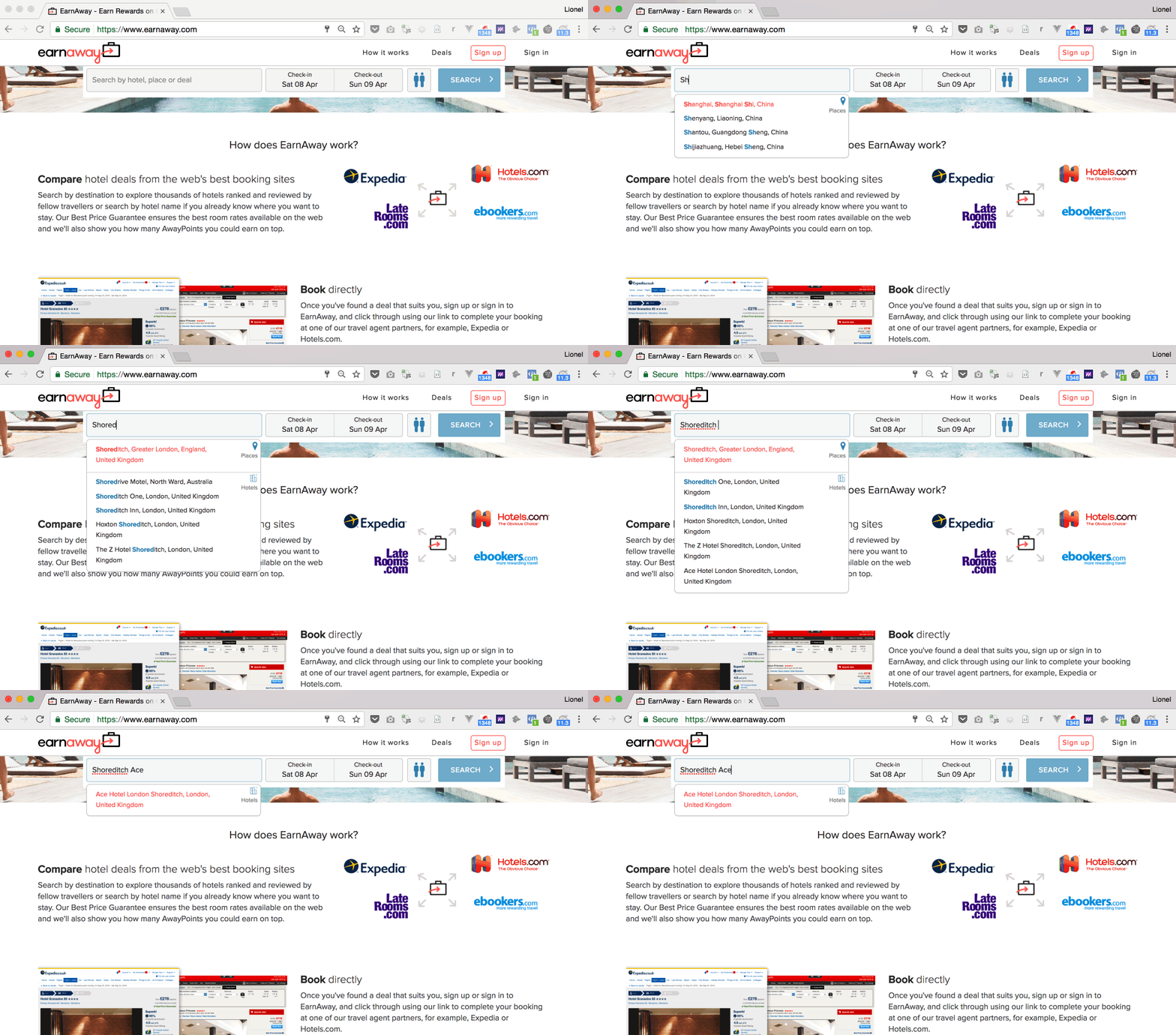
Multi-search involves grouping results in pre-defined categories. It applies more to web platforms that provides a listing of a limited set of possible results, like EarnAway.com (shown below). There are only so many places and hotels you can choose from. You will likely be searching by city, neighborhood, airport, or the exact name of a hotel.
For EarnAway, we suggest both places and hotels. A category can disappear as you type when results aren’t as relevant as other categories.

Ultra-fast multi-search on EarnAway.com
Fuzzy search, symbols, abbreviations..
While you’re there, you will want to support a small numbers of deviations like typos, symbols, and abbreviations (more on this later).
Build a suggestions database
Now that you know what kind of suggestions best fit your platform, you will need to generate the appropriate dataset. For search-as-you-type suggestions, you will need to index your product database into a search engine, and perform full-text search on it.
The keywords-based suggestion is more challenging, as keywords are difficult to generate. You can generate them from crawling but your best bet is to buy a database off-the-shelf.
Autocomplete with geographic data
Most people think of Google Maps autocomplete at this point but there are a few catches. The Google Places search widget gives no control on the experience. You have to use their dropdown, you have to show the “powered by Google” logo, and you can only show places results (e.g. you cannot mix it with your own platform products like the multi-search example above).
If what you need is just a place finder bar that will query your platform’s database with a latitude/longitude, you’re fine.
Anything else and you will quickly be limited by the terms of use.
“You will not use Google’s Content or Services to create or augment your own mapping-related dataset (or that of a third party), including a mapping or navigation dataset, business listings database, mailing list, or telemarketing list.”
It is strictly forbidden to save data coming from this widget into your database, or to enhance your data with it. If you capture a user postal address through this widget, you’re violating the terms of use.
So what options are out there?
Open source alternatives like Open Street Maps come with very inconsistent data, though you might be lucky with using a subset of OSM: Geonames.org. Another nice alternative is Geopostcodes.com (latitude/longitude down to street level, anywhere in the world).

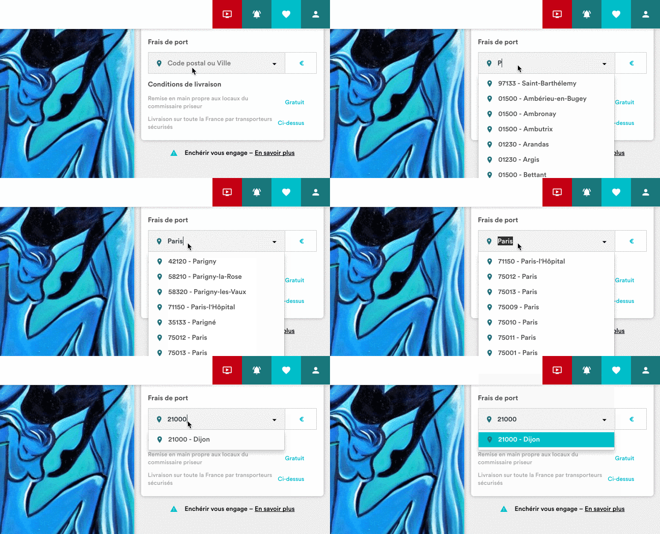
An Amazon-like prototype to estimate shipping cost, on a French auction platform
Both are databases that you need to download and seed in your database, and this is only where the work starts. Results will need to be curated for your needs and much more importantly, ranked.
Ranking suggestions
The hardest thing in search is relevancy. You want to show the most relevant and most likely options first. What’s more likely?
- Your user is searching for London UK instead of London Ontario
- Your user is looking for THE Ronaldo instead of a lesser known Ronaldo

Not quite right yet — Cristiano Ronaldo should come first
For FootballWhispers above, one solution has been to augment our database of players with rankings of their popularity. That is not the kind of dataset you can buy from your local Tesco, so that’s where you’ve got to be inventive.
In that case, since we had their Twitter handle, we’ve been downloading their number of followers as a popularity metric, and ordering the suggestions by showing the most popular first.
For your web platform, the metric could be different. For EarnAway, we’ve been looking at population metrics, but also calculating a “tourism” score based on the number of hotels near each location. It took a beefy AWS server 8 days and nights to process the score, but it still wasn’t feeling right. A landmark in a touristy location isn’t necessary popular itself.
So, we decided to extract popularity from Wikipedia. By basically applying a Page Rank algorithm to a copy of Wikipedia’s data (40GB uncompressed!), we were able to get a popularity index of landmarks. It then took a couple days of processing but the suggestions’ quality instantly improved.

The GoLang script we used to PageRank Wikipedia
Finally, you could also rank the results based on your current user (his location, profile settings or history of search). This is called biased search, and can be configured in Google Places autocomplete, which will return results around a given set of coordinates.
Clearly format the search results**
After all this work of curating your database of suggestions, organizing it as a multi-search, and hacking around to rank your data, it would be a shame not to make it look good, wouldn’t it?
These are some of the things you should consider for your search bar design:
- Placeholder: Take the opportunity to help your users by showing the supported search queries. A generic “Search here” placeholder doesn’t give any clues.

“Country, city, or airport”
2. Highlight the user search terms: See the Amazon screenshot above.
3. Include search history in suggestions: Why not show some helpful content when the user clicks on the search input before he even types anything:

Pinterest showing grouped suggestions before I started typing
4. A backup plan when there are no result: What’s your plan if your search fails to find a relevant suggestion?
5. Avoid scrollbars and keep the number of suggestions manageable, maximum 15.
6. Support keyboard navigation (up, down and enter)
- Use images where appropriate

Williams-Sonoma showing product images in suggestions
So what’s after the suggestions? In the next post, we will discuss the best ways to show your platform products listing, to make sure your user enjoys the search experience, and find what he or she came for.
Technical implementation
I’ll tackle this topic in detail in another post. We’ll look at how to implement performant suggestions and searches using ElasticSearch and PostgreSQL full-text search feature.
Tell me, what’s your favorite website out there in terms of search experience? Which of the functionalities described in this article could immediately improve your own website?
