UX Design Tips: How to Make Amazing Animated Mobile & Web Apps

This article is based on the Codementor office hours hosted by Pasquale D’Silva, the creative director and co-founder of Keezy. Pasquale discusses some ideal skills of animation design and how to make functional animation in both web and mobile products, and he also shares some thoughts on the future of animation design.

Designing Animation is all about timing

It’s one thing designing animation in a linear time way. The frame count and frames per second are generally references for the engineer have an idea of the timing.
What’s really important in designing motions is understanding timing: when do the things happen, coincide with each other, how fast or how slow, what’s the timing function on these things, etc. We try to communicate that in as many ways as possible.
Transitional Interfaces

All interfaces should leverage time as a dimension. We think about the shape, color, form… but another thing that we should think about is time. You can communicate a lot of information with time. The devices we use to made a software on, experienced software with, on the mobile phone or on a desktop… they’re all thing we interact with and connect with. That’s like when you’re dragging something around or clicking, our body is actually moving and responding, and our eyes are looking all over the place. These just hit you with the instantaneous state changes. It’s pretty abrupt. These things should move and respond in the same way that we move and response with interfaces. We try to do as much prototyping as we can to communicate how the interface should move and communicate information.
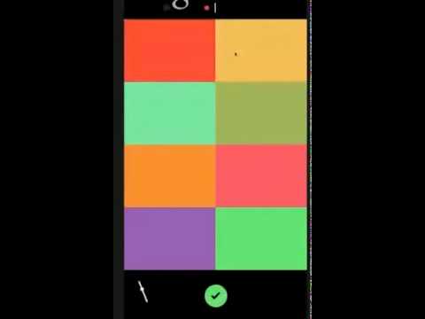
One of the prototypes I’ve made before was a loop maker. In the app, there’s a timeline at the top of the screen, and it would record quantized timing. Also there’s a little metronome animation down here with a record button. Since the timeline would loop, we called it a “memory”. It’s one thing to make wireframes and to draw notes and to make a couple of animation cuts that are linear, but it’s another thing to interact with the actual thing.
The Concept Behind Keezy
Keezy is an iOS app you can record sounds and play with. I built prototypes of Keezy with Jake, who is one of the co-founders and also an engineer.
We wanted to test out something called “contextual zooming”. This has been called a ZUI, or Zoomable User Interface, which is an idea where you zoom into a particular part of an interface to expose detail. Now it has a couple other various properties. For example, you get different levels of detail when you zoom in and out a context. If you pop into a context, you’re exposed to more detail, and if you pull out of the context, you can also remove detail and extract it.

Before these prototypes, Keezy happened inside the Elepath environment. A very early Elepath was an experimental software incubator. A lot of great people were brought into the company and they were able to generate ideas inside the company as trial employees. Unlike regular incubators where you might have an idea outside and you bring it in for mentorship, your job at Elepath was to make crazy ideas.
One of Elepath’s trial engineers, Jarod Luebbert, described the concept of a soundboard app to me, and it was something that could be polished within two days. Basically, the idea was to have 7 soundbanks you could play, pause sounds, and delete. Then we decided to do as little interfaces as possible, and make it all functional and communicate it as broadly as possible. So I drew 8 boxes that would fit the size of an iPhone, choosing 8 instead of 7 because it’s an octave and therefore a musical unit. Instead of having a play or pause button, we made those as functions on the tiles. There was a microphone where you could play things back, and we would come up with a way to delete.
So, for the very first version, you couldn’t save your board, and you couldn’t even delete. You had to restart the app to delete the sounds. However, it was very kinetic from the beginning, where you can have tiles to push them in and they would have a gif to them. When we were coming up with a name for it, Keezy was the first name that came out in my brain, and it happened to stay on years later.
Keezy Drummer
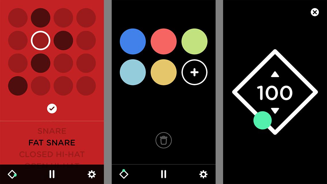
The Keezy Drummer is more of a sequencer, like a live playback of an instrument.
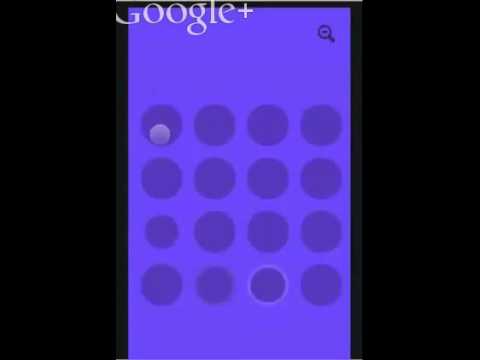
The first prototype of Keezy Drummer was built in the browser before we made it for the iOS. It’s a very primitive prototype, a 16-steps sequencer where you can control the tempo, delete sounds. Two things we focused on was how the interface moves, and what it feels like to drill it to these levels of detail. There are different colors representing different instruments, with a constant ticker going on inside each of them. When you pop into one of these, you’ll see white circle triggering when one of the samples are going to be hit. When you tap on one of them, it should register when a drum is going to be hit, and when you pop out, you can see it can be activated on the inside.
What’s key to the contextual zooming here is that the thumbnail isn’t a little grid of 16 pieces, as that’s far too much information for a little screen. We used motion to degrade and fade it down to show you what’s important, since you won’t care about what’s happening inside but to what’s happening in general.
This prototype was also made with framer.js. This was inspired by hardware, and it was built much like the hardware itself. We did it at first because it was a natural impulse, but a lot of the huser interfaces of music hardware are not intuitive or well-designed. They’re actually pretty poorly designed, but most of the time it’s because it’s the constraint of the hardware.
When we had to make the first version for the iPhone, it was kind of weird. 16 made sense because of its granularity, it’s a division of four, and the classic musical timing is 4/4. We decided to make it 4 x 4, where each line represented a bar, which felt more intuitive because you could see how the beats lined up with each other.
So, the very first version of drummer was an interface of animations where grids pop out and scale down, which helped us understand what contextual zooming felt like. In that process I wasn’t working out how to make it functional, I was trying to make it colorful and not thinking about the composition. I brought my artist’s rendition of it to Jake, and after he engineered it, he got this contextual zooming thing to work. We then brought it to our iOS engineer, Mark, and he spent a day to turn it into the new amazing iOS app.
Handing off ideas to engineer
The process to handing things off to engineers in general when you’re working on an animation depends on the problem you’re solving. There’s no single workflow that makes sense, and I don’t think there will be one because so much of it is a new problem every time. The key is to communicate this stuff as well as possible.
A quartz composer is nice if you want to show how particular things are related to each other, but there might be a project you design where the timing is really important. When you’re dealing with something like the quartz composer, you’d probably think about the implementation. How are these views nested inside of each other?
You don’t have to have an amazing animation timing control, but if you use a linear timeline, you could deliver two prototypes. You can say this is how it should work, this is how the views should move when you click on them. But this linear animation timeline really has the proper timing function in there. Before Keezy, we’ve done web implementation of instruments that involve after-effects compositions, quartz composer, documents, google forms, etc. Sometimes simply mining things out of a video is enough because it’s too complex a thing to be able to put down in pixels. Of course, if you are able to pass over numbers and values in a layout to an engineer, that’s even better because they’d have to do less front-end work, because there’s a lot of work to do just to get the animation’s layout correctly.
Designing a Desktop Animation
On the desktop it’s still pretty kinetic, so that should be reflected in the interface. Of course, it’s not kinetic to the point where everything is bouncing around and it’s too much information for your eyes to handle, but I think any of these points where you’re making a significant motion, or you’re transferring information, it makes sense that communicate that state change.
Wormhole
Wormhole was a desktop file sharing tool you can use to send files to other people in your team. This was before all the great stuff that exists now (e.g. Slack). I wanted to build this HUD that would slide down and you can drag something onto it, and when it finishes uploading, it will slide up and someone would just get a notification of the files. I built it using the same tools I used for Keezy.
So for wormhole the interaction was dragging something to the top of the visor and that requires like quite a bit of force. You communicate that when the visor slides down. For example, when you’re tossing the file in there, you’ll have some momentum and inertia, and when you’re moving up and down really fast it should respond in the same way. Time is also still a dimension, but you don’t design where the simulation is when you first start out. Just design the idea of what looks and feels right first – don’t design it with a physics simulation because you’d spend way too much time designing “time”.
Designing for Fun vs. for Functionality
The Inspiration Behind Keezy
I think that these two are quite opposites as in creating an experimental thing can be done to satisfy yourself. I come from a background in film/TV animation where I make things that were entertaining. There were a lot of things that are just like entertaining to me and I’d make for fun.
Recently, I put out a video called Chromo, a video I made to visualize my color synesthesia, where if I hear a sound/name or see a face, I’d see the color. I thought it was normal, but everyone told me it was unusual. Anyhow, I thought that would be fun to visualize this, so I made a video based on some music that I composed for fun. It was short film for a minute.
Eventually, I realized this could be great for other people. Keezy is a music company that is very visual and animation-driven, and a lot of cues come from my color synesthetic brain. I thought it would be cool if other people could make great videos and manipulate music with colors and pictures.
Thus, I thought if I had the source files to make music, individual stems and tracks, then I could make a cool visualizer-not one with the flatten down tracks, but with all the individual instruments. You could visualize the drum hits, harmonies, etc. You can even do it the other way around and let someone manipulate a triangular, square, or something else and jiggle it around and have it generate music.
So, in terms of designing for pleasure or for functionality, it can work both ways. You can create concepts, and they will inspire you to do something, or you will see a problem, and you can solve it with emotion, for example.
The Future of Animation
I think that we will inevitably have better tools in the future. I think a lot of interfaces feel more like simulations, and you’re gonna have to think about motion otherwise you’ll be left behind-there’s so much information as you can commute.
Not to mention, all these Virtual Reality (VR) startups coming into place. I’ve been spending a lot of time with Oculus, messing around and trying build prototypes for interfaces. I’m not convinced VR is going to be the thing that catches on, but we’ve seen glimpses into the future, and we’re going to see new types of hardware. I’ve been hanging out with this volumetric display company, and it’s been really exciting to think about what the interface would look like for that. Of course, it’s going to be animated. We’re seeing more pieces of hardware like the Nest, and we’re seeing more interfaces for cars and all of these other devices that surpass the stuff we’re doing on the desktop and mobile. We better get familiar with these new things, because they’re not like going built on the same static foundation that we’ve been stuck with for years. They’re going to be new.
Other Posts in This Series:


