6 UX Web Design Best Practices for a Great Website

What use is a beautiful website if the user experience (UX) is sluggish, impractical, or cumbersome? When it comes to web design, there are some elements that make browsing a site much easier for website visitors. Making sure you address these best practices on every design project will go a long way toward making your websites stand out from those of other designers. Your clients will know they can count on you to create a quality website that users will enjoy and return to time and time again.
UX designers, sometimes called architects, have to consider a lot of different elements when planning a website. For example, they must think through content, coordinate with programmers, and look ahead to user experience, such as navigation, page loading speed, and mobile responsiveness.
Since the majority of your clients will likely be business owners, addressing the needs of their customers can help with the business’ bottom line. This, in turn, will garner you additional referrals and work as you gain a reputation of designing beautiful, timely, and usable sites.
Web Design Best Practices No. 1: Responsiveness
Look around any restaurant or waiting room and you’ll notice most people are on their cell phones. Time spent on mobile devices now outpaces time spent on desktops by 51 percent to 42 percent. In fact, Google has changed its algorithms and considers just how responsive your overall design is. This means a website that isn’t very responsive may not even rank well in search engine results.
If a mobile user lands on your website and the site isn’t optimized for mobile, that user is about five times more likely to bounce away from your site. With more and more people using mobile devices each year, it only makes sense to make sure your site can adapt no matter what size screen a site visitor is viewing.
A good example of a responsive design is the Sasquatch Festival website. This website is for a music festival and grabs attention with its bright colors and interesting images. Note in the two images below how the website looks great both on a desktop and on an iPhone 6S Plus.
 Sasquatch Festival website desktop version
 Sasquatch Festival website mobile version
Web Design Best Practices No. 2: Accessibility
As a designer, you have to consider those users who may have disabilities. In the recently released standards for government websites from the U.S. Chief Information Officer (CIO) Council, accessibility is mentioned often. A number of online users have vision impairments, including color blindness.
One thing that designers can easily do to improve the UX for the visually impaired is to make sure alt tags are clear. In addition, avoiding certain colors that would make it difficult for those who are colorblind to fully absorb the text can make the site enjoyable for any one. This readability is extremely important to UX.

One example of an accessible design would be the We Are Colorblind site. Its purpose is to improve online experiences for colorblind users. Notice the simple color scheme and the nice contrast between the background and text so the text is easy to read. The designer even worked in an example of what color blindness can look like for those visiting the site who are not color blind.
Web Design Best Practices No. 3: Filtering for eCommerce
ECommerce sites benefit from adding filtering options. Filtering options allow site visitors to search by category, color, size, etc. By adding filtering options, visitors won’t go frustrated from having to go back to the home page and start over with each new feature of a product. This can reduce your bounce rates. Another way to do this would be adding an incremental search option that anticipates matches for whatever you’re looking for.
Simply improving filtering options can result in higher sales numbers. However, if you add more than 10 filtering options, researchers found you also need to have a way to shorten the number listed at one time. Otherwise, users will miss filtering options and may grow frustrated.

One example of offering effective filtering options can be found at CJ Pony Parts. Note that the search for auto parts can be filtered by the make of your car, the year of your Mustang, brand, type, and whether or not the item is on clearance.
Web Design Best Practices No. 4: Incorporate Site Visitor Suggestions
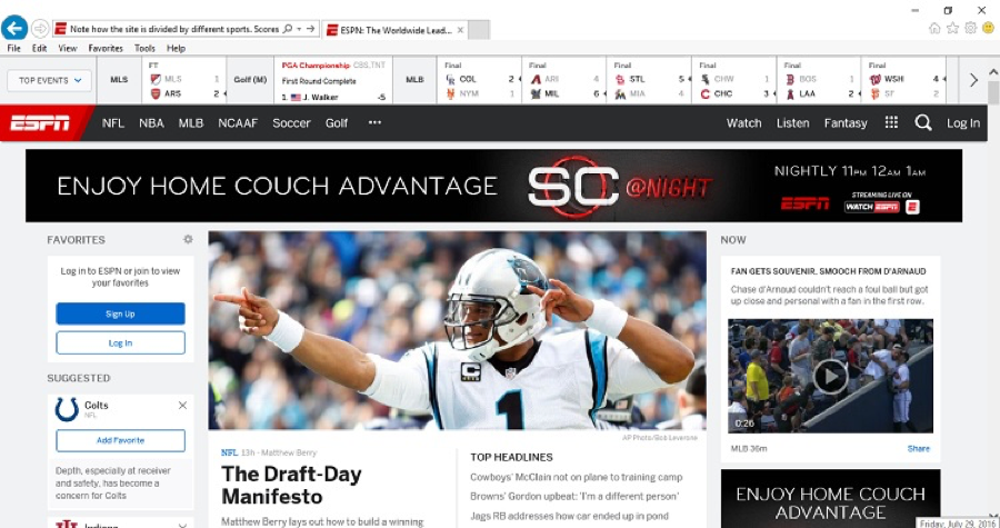
Take the time to poll your regular visitors and get some feedback on what changes they’d like to see in the overall design. When ESPN.com listened to its community and made changes based on suggestions from community members, it had a 35 percent jump in revenue.
You can use things such as multivariate testing to see which elements users prefer and come up with a landing page that works best for your site visitors. For instance, maybe they suggest a live chat option could help in troubleshooting questions about your products or services.

Using the example of ESPN, the site is very user friendly. Note how the site is divided by different sports. Scores are listed across the top of the page for a quick update at a glance for site visitors. Then, popular stories are listed still above the fold.
Web Design Best Practices No. 5: Add Call to Action Buttons and Words
Call to actions (CTAs) can turn browsers into buyers. If your website conversions are not as high as you’d like, this is one simple thing you can change that will drive conversion rates up. However, it isn’t just as simple as adding a button or two that calls for action.
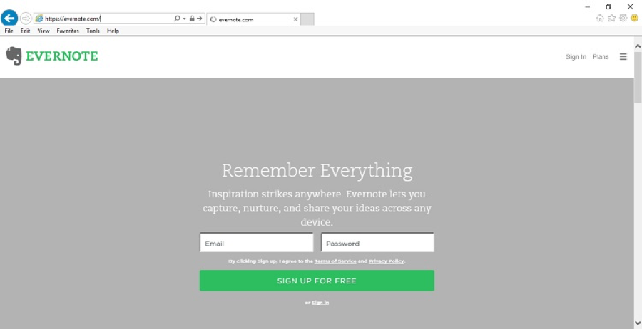
Your target audience may respond better to certain colors, images, shapes, and wording. Even choosing the right font in web design can make a difference. There are some rules of thumb that will give you a place to start, of course. Begin your CTA with an action word and keep your CTA short and to the point. Examples: “Get free ebook” or “Learn more.”

A good example of a strong CTA can be found on Evernote. This site does a simple yet brilliant job of utilizing CTAs. Note at the top the words “Remember everything.” This in itself is a call to action to remember by using its services. Then, there is the CTA button under the sign-up form that reads “Sign up for free.” Note how each example uses strong action words that demand action from the user.
Web Design Best Practices No. 6: Balance with White Space
One thing you might not immediately think of when creating a design for excellent user experience is the amount of white space. Think about reading. You have text and then you have white space. The white space creates a balance so your brain can easily decipher where to go next on the page. A web design works in the same way.

For example, adding some space around titles improves the attention span of site visitors by as much as 20 percent. Notice how the website Higher Plain utilizes white space to draw your attention. The image is bright and colorful and immediately captures the visitor’s eye. However, the white space at the top sets off the text by creating a block effect.
Even at the bottom of the page, a darker background is used to create natural white space around categories such as “Candidates” and “Our Business Philosophy.” You’ll also find social media buttons to allow you to connect with the company through several different social media platforms.
Web Design Best Practices: Conclusion
Ultimately, the best design practices are the ones that make your site an amazing experience for your visitors. If your site visitors truly enjoy their time on your site and find it beneficial, they will tell others, and this will increase your traffic exponentially.
It is well worth the extra effort to redesign a bit so that your site is as user friendly as possible. A redesign doesn’t have to cost a fortune to be effective, but it does need to be aimed at the specific needs of your site visitors.
Author’s Bio:
Lexie Lu is a designer and blogger. She is always researching trends in the web and graphic design industry. She writes weekly on Design Roast and can be followed on Twitter @lexieludesigner.


